Free Art Lessons for Kids: The Elements of Art, Color and Drawing

Free art lessons for kids about 5 to 14, built around the seven elements of art: line, shape, form, space, value, color and texture. Each lesson has a plain definition, what to look for in real artworks and a classroom-tested activity, with printable worksheets for color theory, shading, perspective, portraits and looking at art.

  • No ads, no sign-up. No account, no email, nothing to buy.
  • Free to copy for classes and libraries
  • 11 printable worksheets
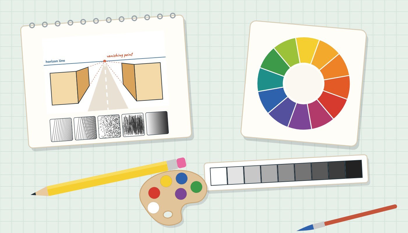
An illustrated art table: a sketchbook with a one-point perspective drawing and five pencil shading swatches, a twelve-part color wheel, a value scale, a pencil and a paint palette

Looking for Artyfactory or Sanford’s Art Edventures? Many school art pages and public-library “Arts & Entertainment” pages link to Artyfactory’s free art lessons and to Sanford’s “A Lifetime of Color” Art Edventures site (“Study Art”, “Teach Art”). Artyfactory’s www address no longer loads, and the old Sanford Art Edventures address now leads to an unrelated gambling site, so please remove that link (checked October 19, 2026).

This page is an independent set of lessons covering the same ground those sites were known for: the elements and principles of art, the color wheel, drawing and shading, art history and a lesson planner for teachers. It is not affiliated with either site.

the building blocks

The 7 elements of art

The elements of art are the basic parts of every drawing, painting, sculpture and design. Learn to name them and kids can talk about any artwork, from a cave painting to a cereal box. Teach them one at a time, then look for all seven in a single painting.

⬇ Elements of art poster (PDF)

1.

Line

A line is a mark that moves from one point to another. It can be straight, curved, zigzag, wavy, broken, thick or thin. Lines outline shapes, lead the eye around a picture and, drawn close together, make texture and shadow.

Look for

  • Outlines (contour lines) around people and objects
  • Lines that point toward the most important part
  • Lines that feel calm (horizontal), strong (vertical) or excited (zigzag)

Words to know: contour line, implied line, horizontal, vertical, diagonal

Try it: Line sampler

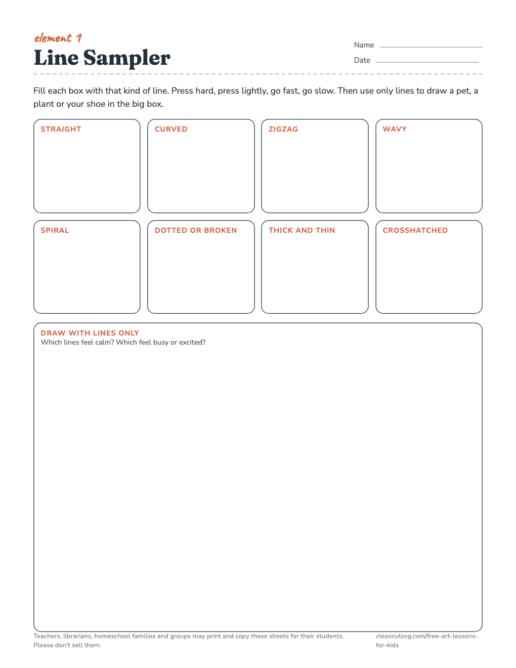
Fold paper into eight boxes and fill each with a different kind of line. Then draw a pet, a plant or a shoe using only lines, no shading or color.

Time: 20-30 min · Grades: K-5

⬇ Worksheet PDF
geometricorganic
2.

Shape

A shape is a flat, closed area with two dimensions: height and width. Geometric shapes such as circles, squares and triangles have exact, measurable edges. Organic shapes, like leaves, puddles and clouds, are free-form and irregular.

Look for

  • Geometric shapes in buildings, signs and machines
  • Organic shapes in plants, animals and water
  • Negative shapes: the empty spaces between things

Words to know: geometric, organic, positive shape, negative shape, silhouette

Try it: Cut-paper shape picture

Cut five geometric and five organic shapes from colored paper and arrange them into a picture before gluing. Henri Matisse made his famous late cut-outs this way, with painted paper and scissors.

Time: 30-40 min · Grades: K-5

3.

Form

A form has three dimensions: height, width and depth. A sculpture is form you can walk around. In a drawing or painting, shading turns a flat shape into something that looks like a form: a circle becomes a sphere, a square becomes a cube.

Look for

  • Sculpture, pottery and architecture (actual form)
  • Shading that makes flat pictures look round (implied form)
  • Highlights and shadows that show where the light comes from

Words to know: three-dimensional, sphere, cube, cylinder, cone, cast shadow

Try it: Shape to form

Draw a circle, a square and a triangle. Turn them into a sphere, a cube and a cone by adding shading and a cast shadow. Older students can then build one form from paper or clay.

Time: 30 min · Grades: 2-8

⬇ Worksheet PDF
backgroundmiddle groundforeground
4.

Space

Space is the area around, between and inside things. Positive space is the subject; negative space is the empty area around it. On a flat page, artists fake depth with overlapping, size (smaller looks farther away), placement (higher on the page looks farther) and paler, less detailed color in the distance.

Look for

  • A foreground, middle ground and background
  • Objects that overlap and shrink as they recede
  • Hazy, bluish color for far-off hills (atmospheric perspective)

Words to know: positive space, negative space, foreground, middle ground, background, overlap

Try it: Three-layer landscape

Fold a sheet into three horizontal bands. Draw big, detailed, strongly colored things in the bottom band, medium things in the middle and small, pale things near the top.

Time: 40-50 min · Grades: 2-8

⬇ Worksheet PDF
lightdarkhighlightcast shadow
5.

Value

Value is how light or dark a color or gray is. A value scale runs in even steps from white to black. Changes in value make objects look round, show where the light comes from and create mood: mostly dark pictures feel heavy, mostly light ones feel airy.

Look for

  • The lightest light (highlight) and the darkest dark
  • Strong value contrast at the focal point
  • Shadows that all fall away from one light source

Words to know: value scale, highlight, core shadow, reflected light, cast shadow, contrast

Try it: Value scale and shaded sphere

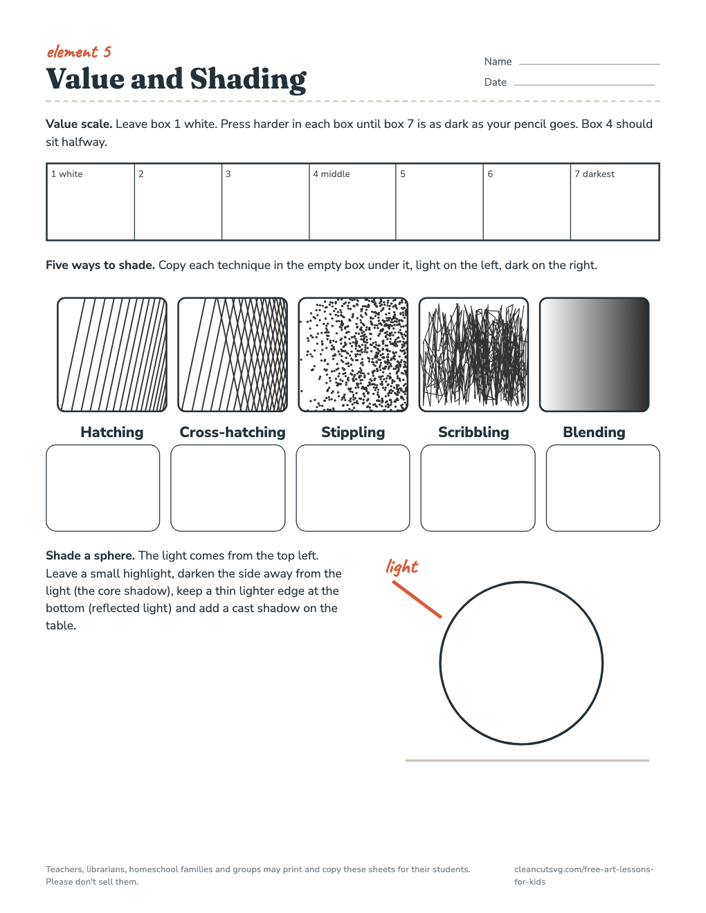
Make a seven-step value scale with one pencil by changing pressure. Then shade a circle into a sphere with a highlight, core shadow, reflected light and cast shadow.

Time: 30-40 min · Grades: 3-8

⬇ Worksheet PDF
RYBwarmcool
6.

Color

Color is what we see when light reflects off a surface. Every color has three properties: hue (its name, such as red or blue-green), value (how light or dark it is) and intensity (how bright or dull it is). Color can show what something is made of, set a mood or pull the eye.

Look for

  • Warm colors (reds, oranges, yellows) that seem to come forward
  • Cool colors (blues, greens, violets) that seem to sink back
  • Complementary colors placed side by side for punch

Words to know: hue, value, intensity, primary, secondary, tertiary, complementary

Try it: Three-paint color wheel

With only red, yellow and blue paint (plus white), mix all twelve colors of the wheel. Keep a mixing record of which two colors made each new one.

Time: 45 min · Grades: 2-8

⬇ Worksheet PDF
7.

Texture

Texture is how a surface feels, or how it looks like it would feel. Actual texture is real and can be touched, such as the bumps of thick paint or woven fabric. Implied (visual) texture is drawn or painted to look rough, smooth, furry or shiny.

Look for

  • Brushstrokes you could feel with your fingers
  • Patterns of lines and dots that suggest fur, bark or stone
  • Smooth areas next to rough ones for contrast

Words to know: actual texture, implied texture, rubbing, pattern, surface

Try it: Texture rubbings to drawing

Lay thin paper over leaves, coins, sandpaper or a sneaker sole and rub with the side of a crayon. Then try to draw each texture by hand using only lines and dots.

Time: 30 min · Grades: K-5

how artists arrange

Principles of design

If the elements are the ingredients, the principles of design are the recipe: they describe how artists arrange line, shape, color and the rest. Books group them a little differently; these eight are the ones most art curricula use.

Balance

How visual weight is spread across an artwork.

Symmetrical, asymmetrical or radial

Contrast

Strong differences placed side by side.

Light and dark, big and small, rough and smooth

Emphasis

The focal point, the part the eye lands on first.

Made with contrast, color, size or placement

Movement

The path the eye follows through the work.

Lines, edges and repeated shapes lead the way

Pattern

An element repeated in a regular, planned way.

Wallpaper, quilts, tiles, textiles

Rhythm

Repetition with changes, like a beat in music.

Regular, flowing or alternating

Unity and variety

Parts that belong together, with enough difference to stay interesting.

One color family, one odd shape out

Proportion

How sizes compare with each other and with the whole.

Scale, realistic or exaggerated

⬇ Principles of design poster (PDF)

Try it: one picture, one principle

Give each table a different principle. Every student makes a small drawing that shows it as clearly as possible, without labels. Swap drawings between tables and guess the principle. Time: 30 min · Grades: 3-8

the color wheel

Color theory for kids

PTSTPTSTPTSTP = primaryS = secondaryT = tertiary

Primary, secondary and tertiary colors

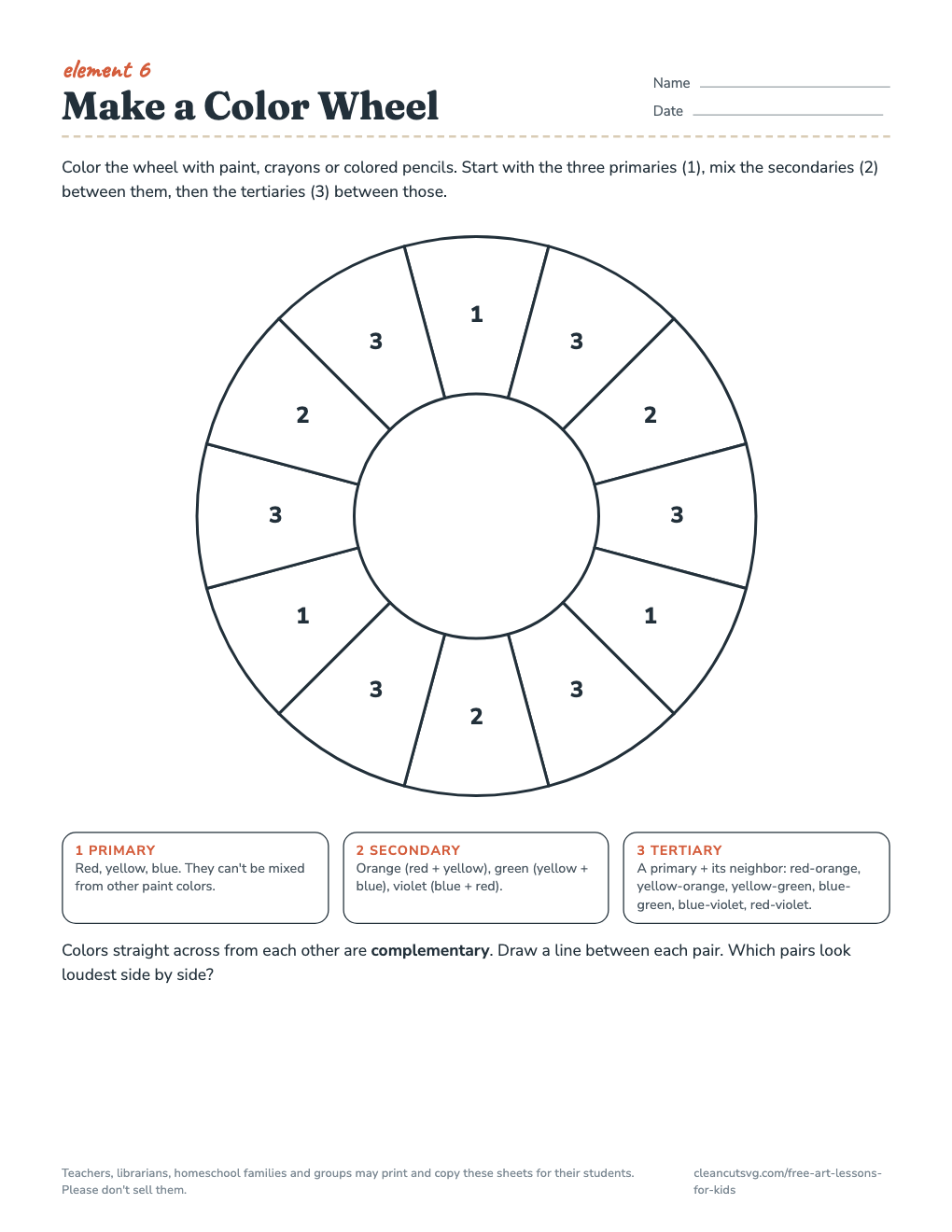
Primary colors (red, yellow, blue) can’t be mixed from other paint colors. Mix two primaries to get a secondary color: red + yellow = orange, yellow + blue = green, blue + red = violet. Mix a primary with the secondary next to it for a tertiary color, named with the primary first: red-orange, yellow-orange, yellow-green, blue-green, blue-violet and red-violet.

This red-yellow-blue wheel is the one most art classes use for mixing paint. Printers mix cyan, magenta and yellow ink, and screens mix red, green and blue light, so their color wheels look a little different.

⬇ Blank color wheel (PDF)

Color schemes

ComplementaryOpposites on the wheel. Side by side they look brighter; mixed together they make brown or gray.
AnalogousThree or more neighbors on the wheel. Calm and harmonious.
WarmReds, oranges and yellows: sun, fire, energy. They seem to come forward.
CoolBlues, greens and violets: water, shade, calm. They seem to sink back.

Tints, tones and shades

Tints: add whiteTones: add grayShades: add black

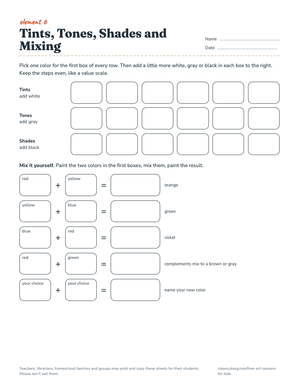
A tint is a color plus white, a tone is a color plus gray and a shade is a color plus black. A picture made from one hue and its tints and shades is monochromatic.

⬇ Mixing chart (PDF)

Complementary pairs

Yellow + violetRed + greenBlue + orange

Try it: paint a small leaf green, then paint a red background around it. Paint the same leaf on a yellow-green background. Which leaf looks greener? Complements make each other look stronger. Grades: 2-8

pencil and paper

Drawing lessons

All the drawing lessons work with a regular pencil (a soft 2B or 4B is nice to have), an eraser and copy paper. Start with shading, because value is what makes drawings look solid.

Lesson 1

Pencil shading techniques and the value scale

Grades 3-840 minPencil, eraser, paper
HatchingCross-hatchingStipplingScribblingBlending

Five ways to shade

  • Hatching: parallel lines; closer together looks darker.
  • Cross-hatching: a second set of lines crossing the first.
  • Stippling: dots; more dots looks darker.
  • Scribbling: loose, overlapping loops and squiggles.
  • Blending: smooth tone, smudged with a tissue or blending stump.

Steps

  1. Draw a row of seven boxes. Leave the first white and press as hard as you can in the last.
  2. Fill the middle boxes in even steps from light to dark.
  3. Fill one strip with each technique, light on the left to dark on the right.
  4. Shade a circle into a sphere: highlight, core shadow, reflected light, cast shadow.
⬇ Shading worksheet (PDF)
Lesson 2

Contour and blind contour drawing

Grades K-820 min

A contour drawing follows the edges of an object with a slow, careful line. In a blind contour, students look only at the object, never at the paper, while they draw. The results look funny, and that’s the point: it trains the eye to really look.

  1. Pick a shoe, a mug or your own hand.
  2. Put the pencil on the paper and your eyes on the object.
  3. Move the pencil as slowly as your eyes move along the edge. Don’t lift it.
  4. Do three blind drawings, then one where you may glance at the paper.
Lesson 3

One-point perspective and landscape space

Grades 4-845 minRuler

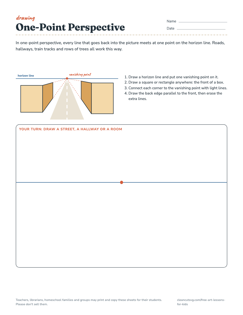
In one-point perspective, every line that goes straight back into the picture meets at a single vanishing point on the horizon line, which sits at the viewer’s eye level. It’s how roads, hallways and railroad tracks seem to shrink to a point.

  1. Draw a horizon line and one vanishing point.
  2. Draw a square anywhere: the front of a box.
  3. Connect its corners to the vanishing point with light lines.
  4. Draw the back edge parallel to the front. Erase the extra lines.

For a landscape without a ruler, use the three layers from the space lesson: big and detailed in the foreground, smaller in the middle ground, small and pale in the background.

⬇ Perspective worksheet (PDF)
horizon linevanishing point
Lesson 4

Portraits: face proportions

Grades 3-840 minMirror

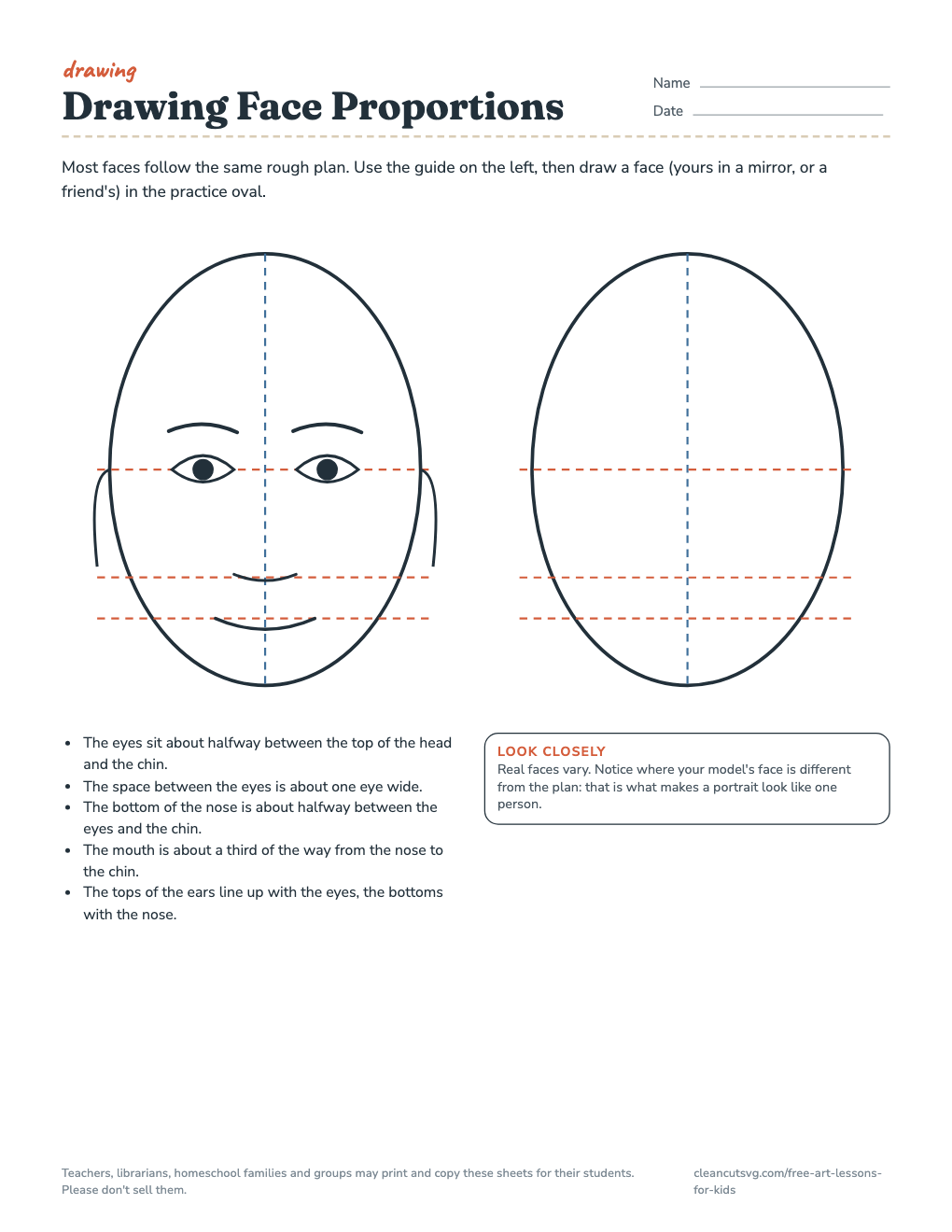
Kids usually draw eyes near the top of the head. On most faces they sit about halfway down.

  • Eyes: about halfway between the top of the head and the chin, about one eye-width apart.
  • Nose: its bottom about halfway between the eyes and the chin.
  • Mouth: about a third of the way from the nose to the chin.
  • Ears: between the eye line and the bottom of the nose.

These are averages, not rules. Ask students to look for where their model is different; that’s what makes a portrait look like one person.

⬇ Face proportions worksheet (PDF)
Lesson 5

Pop-art portrait

Grades 3-82 sessionsMarkers or paint

Pop artists in the 1950s and 1960s borrowed the look of ads and comics: bold outlines, flat bright color, repetition and printed dots.

  1. Draw a simple self-portrait outline from a mirror or photo, using the face proportions above.
  2. Trace or photocopy it four times on one sheet.
  3. Color each copy in a different, unrealistic color scheme: a green face, a pink background.
  4. Add a dot pattern to the backgrounds with a pencil eraser dipped in paint or a marker.
art appreciation

How to look at a work of art

Talking about art is a skill kids get better at with a structure. Two well-known routines:

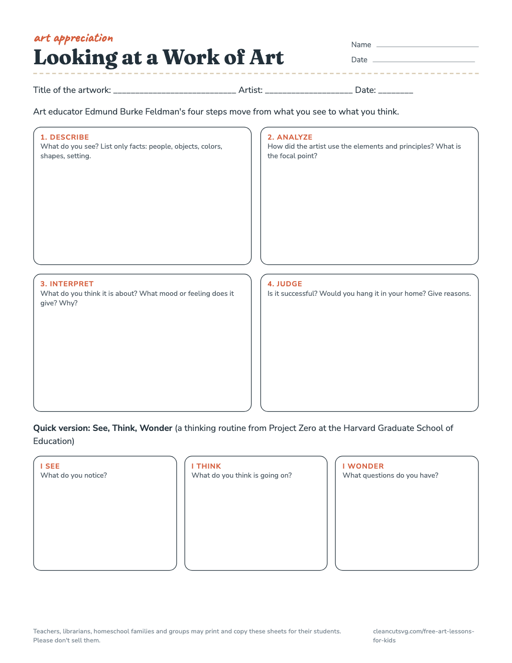
1. DescribeWhat do you see? Only facts: people, objects, colors, setting.
2. AnalyzeHow are the elements and principles used? What is the focal point?
3. InterpretWhat is it about? What mood does it create? What makes you say so?
4. JudgeIs it successful? Would you choose it for a museum? Why?

These four steps come from art educator Edmund Burke Feldman and move students from what they see to what they think. For younger kids or a five-minute warm-up, use See, Think, Wonder, a thinking routine from Project Zero at the Harvard Graduate School of Education: What do you see? What do you think about that? What does it make you wonder?

⬇ Looking at art worksheet (PDF)

artists and movements

Art history for kids

A short tour of styles that turn up again and again in school art lessons, each with a hands-on activity.

1400s-1500sItalian Renaissance1600sDutch still life1870s-1880sImpressionismAbout 1907-1914Cubism1910s-1964Giorgio Morandi1950s-1960sPop Art
1400s-1500s

Italian Renaissance: Leonardo and the Sistine ceiling

Renaissance artists in Italy studied anatomy, nature and the new geometry of linear perspective, which made flat walls look like deep rooms. Leonardo da Vinci (1452-1519) filled notebooks with drawings of plants, machines, water and the human body. Michelangelo painted the ceiling of the Sistine Chapel in Rome between 1508 and 1512.

Try it: Keep a Leonardo-style notebook page: draw one object three times from different sides and write notes about how it works.

1600s

Still life and vanitas

Dutch painters made still lifes, careful paintings of objects arranged on a table. A vanitas still life adds symbols that life is short: a skull, a candle that has gone out, a watch or an hourglass, wilting flowers. Harmen Steenwyck's An Allegory of the Vanities of Human Life (about 1640, National Gallery, London) is a well-known example.

Try it: Set up a still life of five objects that tell something about you. Draw it from one viewpoint, light coming from one side.

1870s-1880s

Impressionism

Claude Monet, Berthe Morisot, Camille Pissarro and others painted outdoors with quick, broken brushstrokes to catch light and weather at one moment. Monet painted the same subject again and again at different times of day, as in his series of grainstacks (1890-1891).

Try it: Paint or color the same view from a window twice, once in the morning and once in the afternoon. What changed?

About 1907-1914

Cubism

Pablo Picasso and Georges Braque broke objects into flat, faceted planes and showed several viewpoints in one picture. In about 1912 they began gluing paper and other materials into their work, the start of collage as fine art.

Try it: Draw a cup from the front, the side and the top. Cut the drawings into pieces and reassemble them into one cubist cup.

1910s-1964

Giorgio Morandi

The Italian painter Giorgio Morandi (1890-1964) spent most of his life in Bologna painting quiet still lifes of the same bottles, jars and boxes, again and again, in soft, muted colors.

Try it: Draw the same three containers three times, moving them a little each time. Use only tints and tones (no pure, bright color).

1950s-1960s

Pop Art

Pop artists borrowed from advertising, comic books and packaging. Andy Warhol repeated celebrity portraits in bright, flat silkscreen color; Roy Lichtenstein painted comic-strip panels with the printed dots used in cheap color printing.

Try it: Make the pop-art portrait in the drawing lessons above.

Museum collection websites (the National Gallery in London, the Metropolitan Museum of Art, the Art Institute of Chicago and the National Gallery of Art in Washington, among others) show high-resolution pictures of many of these works for free.

culture and design

African masks: a design lesson

Masks are made across many cultures in Africa, often for particular ceremonies, and many are worn in performances with a costume, music and dance. A mask in a museum case is only one part of the object as it was used, so start by looking at real examples in museum collections, such as those of the Metropolitan Museum of Art or the Smithsonian’s National Museum of African Art, and read the labels together.

The Senufo peoples live in northern Côte d’Ivoire and nearby parts of Mali and Burkina Faso. Senufo carvers are known for small, carefully balanced wooden face masks with a calm oval face and decorative shapes around the edge. Look at examples together and notice the design choices: symmetry, repeated patterns, simplified features and exaggeration.

The design activity (grades 3-8, two sessions)

  1. Fold paper in half or use the template’s center line.
  2. Design one half: an exaggerated feature, at least two patterns, shapes that say something about you.
  3. Mirror it so both halves match.
  4. Color with a limited palette chosen on purpose.

Ask students to design an original mask about themselves rather than copying a specific ceremonial mask, and to name the culture and museum of any example they studied.

⬇ Mask symmetry template (PDF)
graphic design

Design a logo

A logo is a small, simple mark that stands for a company, a team or a club. The word comes from logotype, a printing term for a single piece of type that carries a whole word. Trademarks are old: the red triangle of the British brewer Bass was the first trademark registered under the United Kingdom’s Trade Marks Registration Act of 1875, in January 1876.

1. sketch ideas2. simplify3. test in one color

What makes a good logo

  • Simple enough to draw from memory
  • Readable when tiny, like an app icon
  • Works in one color
  • Says one idea, not five

Try it (grades 4-8, 45 min)

  1. Invent a club, team or shop.
  2. Sketch ten quick ideas in small boxes.
  3. Pick one and simplify it: remove every detail it can live without.
  4. Redraw it in black only, then in two colors.
words to know

Art words glossary

Analogous colors
Colors next to each other on the color wheel, such as yellow, yellow-green and green.
Atmospheric perspective
Making distant things paler, bluer and less detailed so they look far away.
Complementary colors
Colors opposite each other on the color wheel: red and green, yellow and violet, blue and orange.
Composition
The way the parts of an artwork are arranged.
Contour line
A line that follows the outside edge (and sometimes inside edges) of a form.
Focal point
The area the eye goes to first; the center of interest.
Horizon line
The line where land or sea seems to meet the sky; it sits at the viewer's eye level.
Intensity
How bright or dull a color is. Mixing a color with its complement lowers its intensity.
Landscape
An artwork whose main subject is natural scenery.
Medium
The material an artist uses: pencil, paint, clay, collage, photography. The plural is media.
Monochromatic
Using one hue plus its tints, tones and shades.
Negative space
The empty space around and between objects.
Plein air
Painting outdoors, from life (French for "open air").
Portrait
An artwork that shows a particular person; a self-portrait shows the artist.
Still life
An artwork of objects that don't move, such as fruit, flowers, bottles or books.
Vanishing point
In perspective drawing, the point on the horizon line where receding parallel lines appear to meet.
print and copy

Printable art worksheets

11 one-page worksheets, US letter size. Print at 100% (“actual size”).

The 7 Elements of Art poster preview

The 7 Elements of Art poster

All seven elements on one page with pictures and definitions.

⬇ PDF
Principles of Design poster preview

Principles of Design poster

Eight principles of design with small diagrams.

⬇ PDF
Line sampler worksheet preview

Line sampler worksheet

Eight kinds of line to practice plus a lines-only drawing box.

⬇ PDF
Value and shading worksheet preview

Value and shading worksheet

Value scale, five shading techniques and a sphere to shade.

⬇ PDF
Make a color wheel preview

Make a color wheel

A numbered blank wheel for primary, secondary and tertiary colors.

⬇ PDF
Tints, tones, shades and mixing chart preview

Tints, tones, shades and mixing chart

Tints, tones, shades and five mixing problems.

⬇ PDF
One-point perspective worksheet preview

One-point perspective worksheet

Four steps plus a practice frame with a horizon line.

⬇ PDF
Face proportions worksheet preview

Face proportions worksheet

A labeled guide and a practice oval with guide lines.

⬇ PDF
Looking at art worksheet preview

Looking at art worksheet

Feldman's four steps and See, Think, Wonder.

⬇ PDF
Symmetry mask design template preview

Symmetry mask design template

Face template with a center line, sample half and checklist.

⬇ PDF
Art lesson plan template preview

Art lesson plan template

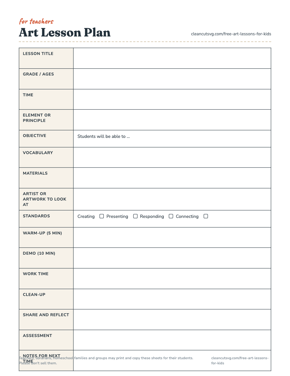
One-page plan with standards check boxes and timing.

⬇ PDF
for teachers

Art lesson plan template

A one-page plan with room for the objective, vocabulary, materials, the artwork you’ll look at and timing for each part of the class. Check-boxes cover the four artistic processes in the National Core Arts Standards: Creating, Presenting, Responding and Connecting.

A 45-minute art class that works

  1. Look (5 min): one artwork, See-Think-Wonder.
  2. Demo (10 min): show the one new skill, step by step.
  3. Make (20 min): students work; circulate and ask questions.
  4. Clean up (5 min).
  5. Share (5 min): two or three students name the element they used.
⬇ Lesson plan template (PDF)
Art lesson plan template preview
questions

FAQ

What are the 7 elements of art?

Line, shape, form, space, value, color and texture. They are the basic parts every artwork is built from. Some books also list pattern as an element; this page covers it with the principles of design.

What is the difference between the elements of art and the principles of design?

The elements are the ingredients (line, shape, color and so on). The principles, such as balance, contrast, emphasis and rhythm, describe how an artist arranges those ingredients.

What ages are these art lessons for?

Most activities work for kids about 5 to 14. Each lesson lists suggested grades; younger children can do the same activity with fewer steps and bigger materials.

Can I print and copy the worksheets for my class?

Yes. Teachers, librarians, homeschool families and groups may print and copy the worksheets for their students. Please don't sell them.

Do I need special art supplies?

No. Almost everything works with copy paper, a regular pencil, an eraser and crayons or colored pencils. The color lessons are best with red, yellow and blue paint plus white, but colored pencils will do.

Which color wheel should kids learn?

The red-yellow-blue wheel used here is the one most art classes use for mixing paint. Printers mix cyan, magenta and yellow ink, and screens mix red, green and blue light, so those color wheels look a little different.

plain terms

License for schools, libraries and families

Teachers, librarians, homeschool families and groups may print and copy these sheets for their students. Please don't sell them.

  • Copy them for a whole class, an art club, a library program or a homeschool co-op.
  • Post the PDFs on a class page, a shared drive or a LibGuide.
  • Please don’t sell the worksheets or put them in a paid product.

This license covers the worksheets and diagrams on this page. Everything else on cleancutsvg.com stays under our regular file license.

for teachers and librarians

Cite or link this page

No ads, no sign-up, nothing to buy. You’re welcome to link to this page from a library guide, an art department page or a class website, including in place of an old Artyfactory or Sanford Art Edventures link.

APA: Clean Cut SVG. (2026). Free art lessons for kids: The elements of art, color and drawing. https://cleancutsvg.com/free-art-lessons-for-kids/

MLA: “Free Art Lessons for Kids: The Elements of Art, Color and Drawing.” Clean Cut SVG, 2026, cleancutsvg.com/free-art-lessons-for-kids/.

Found an error or want a worksheet for a lesson you teach? Email hello@cleancutsvg.com. Diagrams and worksheets drawn by Clean Cut SVG; page last checked October 19, 2026.

More free printables for schools and libraries

For hands-on making, see free kids’ paper crafts with printable templates. For student projects, the guide to free clip art for school projects lists image sources that are safe to reuse.